WHY ARE WE WORKING DIFFERENTLY THIS YEAR?
Due to the current occurrence, the world as we knew it changed. From being able to go out whenever you wanted to staying home, from seeing friends to only seeing those from your household, from being boundless to restrictions. Life as we knew it changed. Now as we are back at school, we are limited to the things we can do: we are limited to the people we can see; we are limited to the places we can go, and this affects photography as we would roam around school to take photographs and use the school cameras. Photography would also be different as we won't have as much as independence like we had last year.
HOW CAN RESTRICTIONS HELP US BE MORE CREATIVE?
In a way quarantine was a blessing in disguise, as without it many people would still be struggling to find out who they are as a person, what they enjoy doing, and the ways in which they can express themselves. Quarantine opened up our eyes to new styles of art, new ways of being creative, and new ways of presenting ourselves. People began to speak about issues some face in our world and ways in which we can overcome them. Restrictions allow for us to think about new ways in creating a piece of art, whether that's be creating work digitally or adapting an idea by using the things you have with you. Restrictions allow for safety and precautions however they also cause for a new way of thinking and developing an idea.
WHY ARE ARTISTS GOOD AT PROBLEM SOLVING?
Artists have a way of overcoming challenges they face as their lives and work revolves around creativity and uniqueness. They find a way of finding ways around whatever life throws at them. Artists know how to adapt to new settings as their environment is in a field of work which is like no other. They have to be optimistic continuously and allow for their works to take a mind of their own, this means that they follow their instincts.
WHAT DOES THE PHRASE 'MAKE DO AND MEND' MEAN TO YOU?
The phrase 'Make Do & Mend' suggests that a work of art can be tailored to you, you can change a photograph whether it is by adding another element to it, or subtracting an object to make it less crowded. 'Make Do & Mend' also could suggest to fix and to create. For me, it suggests that no matter the problem, there is always a solution.We can refine pieces rather than developing a whole new idea.
|
This film is from the archives at the Imperial War Museum. It is a document of an exhibition, and visitors to the exhibition were given demonstrations on how to make use out of limited resources (such as: upcycling rubbish; working with certain limitations whether its time, space, money, or materials). This film shows how to mend clothes and use ingenious solution out of domestic life, as their target audience was 'housewives'. It also shows how people remained stylish, without having the money to do so, and making it themselves.
|
|


This activity was to organise our things in our bags. Although this task was simple, I think we were given this task to help us think about composition and framing. I thought about the ways I could display my things without making it look over-crowded.


This next activity was to fold the images of famous people in different ways to change their facial features or the structure of their face. I think this task allowed us to think about the ways we present our work and how change can be used to create a new piece. I liked this task as it was quite fun and it didn't require a lot of thinking. We had to use our own imaginations and create a new person by just a few changes.
Instructions |
My instructions |
|
When taking photographs, I use:
|
|
Adding And Subtracting
In this lesson, we were given a photograph and we were told to cut them and rearrange them. This was the process I took to get to the finish product. I didn't like how it turned out, as it looks uneven. However, I liked how two products could be made out of one photograph. I would like to try this again but make it look more neater as there is a lot of the paper peeking through.


As I was not pleased with my result, I redid the process on the same photograph. I liked how the images looked more put together and organised. I also ensured that when I was placing it onto the piece of paper, I did not lose track of where I was. I think the reason why I went wrong last time was because I was thinking too much about it. However, with this image there is not a lot of gaps between each piece.


Marcel Duchamp & The Readymade

Leonardo da Vinci - Mona LIsa or La Gioconda, c.1503-1517
|
The Mona Lisa is the most famous painting in the world and it is located at the Louvre in Paris, behind bulletproof glass, its so well protected, and the history adds to the painting. One of the reasons why it's so popular is because of her eyes and her smile. Da Vinci painted her eyes so it falls in the centre of vision of the viewer and also it seems like it follows you wherever you go. The Mona Lisa was stolen, which caused chaos throughout France. When the painting was returned it was a relief and this is the reason as to why it is now the most protected painting.
A lot of mystery surrounded Mona Lisa as nobody really knew anything about her. Nobody knew who she was, how she knew Leonardo da Vinci, how she became well known, all of these questions nobody had answers to. Everyone wondered why the painting was stolen, how it became so well known that it had a world tour in the 19th century. |
|
Marcel Duchamp was a French, American artist, sculpture and writer. His work was associated with Cubism, Dada and conceptual art. However he became really popular when his work of defacing Leonardo da Vinci's painting of the Mona Lisa, in the year 1919. He chose this painting as he wanted to cause some controversy and commotion, he also chose this painting as it symbolised natural female beauty. When Duchamp chose to add his own touch to the Mona Lisa, the painting was already in the louvre, this probably worked in his favour as his reaction was a joke at the expense of Da Vinci's art.
Marcel Duchamp couldn't deface the original painting as it was known worldwide so instead he defaced a photograph version of the Mona Lisa. Duchamp defaced the Mona Lisa by adding a moustache and a goatee. He took an already made painting, photographed it, and added his own touch to it. It was a shock when Duchamp had changed it as he added masculinity to a woman, he portrayed gender fluidity, which wasn't normalised and common like it is today. It was almost as if he was sexualising her and making a joke out of it by mocking it. Duchamp had a female alter eagle by the name Rrose Sélavy, he created her to undermine the idea that art works are only created by single, unchanging individuals. Hover this was very contradicting as under the replica he wrote L.H.O.O.Q which pronounced with a French accent sounds like 'Elle a chaud au cul'. This means 'She has a hot ass' or 'She is hot in the arse', this is a vulgar expression which implies that she has sexual restlessness. |

Marcel Duchamp - LHOOQ, 1919
|
Duchamp took objects such as toilets, photo cards, snow shovels and called them works of art. He altered the way people saw these objects by either turning them upside down, signing them, putting them in an art exhibition and giving them titles. The word 'ready made' has connotations that these materials haven't been interpreted the same way in which artist view them. Duchamp challenged the conventions of art. He wanted people to view art and notice the culture and the society that makes them. He wanted artists to be their own and change the way people view everyday life. Duchamp changed the art world as he took objects that were used on a daily basis and made them his.
|
|
This video explains the background of the Mona Lisa and how the painting became famous and why Duchamp decided to add his own style to the painting.
|
Marcel Duchamp’s picture ‘L.H.O.O.Q.’ (1919) uses a postcard reproduction of Leonardo da Vinci’s ‘Mona Lisa’ (1503-17).
Describe Leonardo’s painting and explain why it is so famous.
The Mona Lisa is a painting of a woman dressed in a translucent veil, dark robes and no jewellery. The smile and the eyes of the painting are also quite interesting, as they eyes look like they are following you no matter what angle you look at it from. The Mona Lisa took Leonardo da Vinci between the year 1503-1519. The Mona Lisa is very famous as the painting became apart of the royal collection in France, such as the palaces, until the revolution claimed that it belonged as the property of the people. The painting also got stolen causing it to catching the eye of everybody (worldwide). The painting was then found in Italy, when a man alerted the local authorities after a man had contacted him about selling it. The Mona Lisa then did a tour of the world and is now held in the Louvre behind a bullet proof glass.
Now describe Duchamp’s ‘L.H.O.O.Q.’ What has he done to the reproduction of Leonardo’s painting? What does the title mean? Why might he have added male facial hair to the female portrait?
Marcel Duchamp brought the attention back to the Mona Lisa and started a trend, which caused the painting to be the most recognised in the world. He played around with it by drawing on a moustache and a goatee. It was a shock when he had done this as he added masculinity to a woman, portraying gender fluidity, and also sexualising her and making a mockery out of it. Underneath the recreation he added in the letters ‘L.H.O.O.Q.’ which pronounced with a french accent sounds like ‘Elle a chaud au cul’. This translates to ‘She has a hot ads’ or ‘She is hot in the arse’. This vulgar expression implies that she has a sexual resentment.
What do you understand by the term ‘readymade’? In what ways is ‘L.H.O.O.Q.’ a readymade?
Something that has already been created or made but you make it yours by adding your own touch to it. L.H.O.O.Q is a readymade as Leonardo da Vinci made the Mona Lisa, however Duchamp came with the idea of expressing gender fluidity by adding in a moustache and a goatee. He made it his by adding his own touch to it.
Why was Marcel Duchamp’s idea of the ‘readymade’ such a revolutionary idea in art?
Duchamp asserted the principle that what is art is defined by the artist. Duchamp took objects such as toilets, photo cards, snow shovels and called them works of art. He altered the way people saw these objects by either turning them upside down, signing them, putting them in an art exhibition and giving them titles. The word 'ready made' has connotations that these materials haven't been interpreted the same way in which artist view them. Duchamp challenged the conventions of art. He wanted people to view art and notice the culture and the society that makes them. He wanted artists to be their own and change the way people view everyday life. Duchamp changed the art world as he took objects that were used on a daily basis and made them his.
Kensuke Koike


Kensuke Koike is a Japanese contemporary visual artist, who's work involved manipulating images from the past. He would cut out and tear parts of these images (majority of the time being the faces) and he would then reorder the cut out parts and make the photograph his own.
Responses to Kensuke Koike:


This is my interpretation of Kensuke Koike's work. I used a photograph of Walter Tull. I don't really like the final outcome as some of the pieces look out of place. The next time I do this I'll cut out squares instead of lines so it is easier to work with. I found that the lines didn't stay where I placed them and they also kept moving around, however the piece still turned out fine. This taught me that mistakes are fine and acceptable. I like the upside down version as it contrasts the original. I would like to do this again but by flipping around the face.


I did another response to the artist because I liked this style of work. It was quite simple to do as only one area is being changed. I like Koike's work as it left a memorable message that even the smallest amount of change could change the depiction of an image.
Sharon Walters
Sharon walker is a London based artist, who showcases the culture of black people and embraces their natural beauty. For example: their hair, their clothing, and their background. Majority of her work is based around black women. Her series 'Seeing Ourselves' explores the beauty standards, identity, and stigmas based around race. The pieces uses magazines and photographs and with this Walters cuts out outlines of their natural hair, to highlight that beauty is everywhere.


Responses to Sharon Walters:
For this task, I chose a photograph called 'The elders'. This a photographic collaboration between Franklyn Rodgers and Simon Rowe. Rodgers was born in the year 1963, in London and Rowe was born in Leeds. This photograph links to the 'Wind rush generation' as it pays homage to Caribbean men and women, 60 years after they arrived in Britain in the late 40's and 50's.

|
The picture is of a man standing in front of a blank wall. From my point of view, it seems as if the photograph represent the black community and how everyone has lived a different life. It seems as if the red glasses represent him looking back at his past from a different lens, and his eyes holding onto his background. Looking at the other pictures in this collection it seems as if each individual has been shaped into a new person, whether its their name that has changed, the society they grew in or their surroundings and that makes them see the world from another outlook, but the colour allows them to see in the past and their upbringing. If i was interviewing the man in the image, i would ask him what life means to him, how he adapted to change, and what the red in the image represents for him. The narrative of this photograph is that the background is very minimalistic as the person being photographed eyes hold the story. As the man is the vocal point of the photograph, the red emphasis that life has so much more to it than what meets the eye and you never know someone truly unless they share that aspect of themselves with you. If i had to make a headline for this photograph i would call it 'The Lens', as everyone loos at life differently due to how their upbringing was.
|


From the portrait we chose, we were told to cut out different sections like Sarah Walters did with her work. I placed the photograph on top of a background to change the way the image was portrayed. I like how in the first photograph, the sections that i cut out contrast with each other. However I feel as if the photograph could be better if the background was different, for example a more vibrant background, instead of it being the same photograph but in black and white. It could also be better if i cut out more sections so it's more complex.


I created this piece inspired by Sharon Walters. I cut out these photographs to keep the outline. I like that I cut out more for the first photograph but left the second photograph quite full. This meant that when I combined them together the images merged very well together. Cutting off the afro and majority of the face in the fist photograph gave me more space to work with at the top and it also allowed me to place the man underneath. I would like to place the cut outs onto a vivid background.


I photoshopped my cut out onto a natural background. I found that the colours in the background toned out the darkness of the images. The process was quite difficult as cutting out my image took longer than expected. I am pleased with my result, however it would be better if I cut out the layered image more cleaner. I like the background of the second photograph more as there are more brighter colours which fill the whole photo.
Hannah Höch
Hannah Höch was a German dada artist. Höch’s inspiration was Pablo Picasso, as she used similar techniques that he did in his work. She was born on November 1st 1889, in Gotha, Germany and died on May 31st 1978, in Berlin, Germany. Her work of the Weimar period was the reason she was very known. Also she was one of the originators of photomontage.


Hannah Höch’s work is abstract, as she used different sections from magazines and newspapers to create her own art. She cut out different parts of people’s faces, people’s body’s, car parts, clothings and layered them. This links to make do and mend as she was making readymades by taking parts of different artists work and combining them to make it her own.
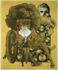
'The Beautiful Girl'
|
This artwork is made up of two main elements, they are: inhumane objects and different parts of a women's body. The light bulb in this image replaces a woman's head, perhaps to suggest that women are just as intelligent as men despite them being seen as inferior. Also when bulbs replace heads, they suggest an idea or a motive. The clocks could connote that women are seen as working factories, and how when men went to war women took over their jobs. This photomontage can also refer to the sexism in the society they lived in, and how women were objectified. Höch went against societies rules and ideas by portraying women as intelligent in her photomontage Also her work contained parts of a BMW, this could be because she was from Germany.
|
For this artwork, there is no lighting consideration as it has been glued down. The materials used to create this work is magazines and newspapers. The used of orange and blue contrast each other as they are on the opposite sides of the colour wheel. The yellow as the background gives the photomontage a rustic aura. The use of black and white shows that colour film was extremely rare and in the 20's colour film was beginning to get innovated. This photomontage's title 'The Beautiful Girl' could connote that society portrays men as the stronger and more intelligent gender, which is why men were drafted to war.
Responses to Hannah Höch


This is my first response. I like how the red and the blue portray a statement. When creating this collage, I used the idea that beauty can be influenced by patterns. I like the colour scheme and the magazine sections I used. I tried different methods and techniques until I found one that I liked. In order to improve it I'll add more sections to the left side as it looks quite empty. However this piece didn't reflect Höch's style so I would like to create a piece that is inspired by her.

I like this response a lot more as it looks more detailed than the last one. This looks more like the artists' work as she works a lot with woman and jobs that seem more masculine. I like the use of the lips and the eye on the girl as well as the upside down face, as it makes the image look more abstract. I found it very enjoyable as chance was a huge factor when creating this piece. Although I chose where the pieces went, I was not sure how the piece was going to turn out. I like this style of work as it allows you to be more creative. When creating this piece, I thought about how woman tend to be sexualised and how they are seen for their beauty.
David Samuel Stern
David Samuel Smith is an artist and photographer, whose work attracts large audiences. He wanted to show subject in an evocative matter that sparks a meaningful reaction. When creating his work he doesn't really think about how the viewers gonna react to it.
When asked "... Do your pieces aim to express the identity of yourself to those depicted?"
He responded with "... The identity of the sitters probably gets more mysterious from the viewer’s end, but I hope that this begs the question how much did we ever really know about the person pictured in a portrait by looking at that very portrait? What does looking at any kind of image ever really get us? When we look at images, I don’t think seeing the thing we’re looking at is where the truth is."
I think that it's very interesting that an artist can portray an image to show their train of thought and the interpretations the viewers have might not be the same. It comes to show that everyone thinks differently and where we think the truth lies might not be where it actually is.


Stern makes his photograph by weaving two photographs. He does this as he aims to build a bridge between direct portraits and abstraction. His work explores portraiture, time and the nature and origin of the work. I like his work as I looks seamless because although it takes some time to figure out what the original photograph was, the weaving allows for the image to take a mind of its own and be warped.
Response to David Samuel Stern:

|
This is my work inspired by the artist David Samuel Stern. I really enjoyed making this as it was quite simplistic but added a lot of character to the photograph. However, in order to improve my work I can make the lines smaller so it's more complex, can hold more than two photographs, and it will link to Stern's work more. I could also improve my response by using of photograph of my own from two different perspectives.
|
Maurizio Anzeri
Maurizio Anzeri makes his photograph by sewing directly into found vintage photographs. The combined media of the antique appearance of the photograph and the sharp lines and silky shimmer of the thread gives an effect of a dimension where history and future coverage is present. He took inspiration for his work from his own personal experiences and observations of how different cultures, bodies are treated as a living graphic symbol. Therefore, Anzeri works with sewing, embroidering and drawing to decorate the figures but it also suggests that it is revealing a person’s thoughts or feeling through an aura, psychologically.


I like Anzeri’s work as it’s not what you would normally expect. Also, his work consists of straight lines so it looks sharp and consistent. His embroidered images suggests that there are other possible evolutionary dimensions for the people pictured. The works he created has a surrealist undertone. Anzeri also tends to sew on black and white photos, I think he does this so the colour thread he uses really stands out.
Response to Maurizio Anzeri:


I based this work on Maurizio Anzeri. I liked how the peach kind of blends in with her skin but contrasts with the teal. I also like how the line is constant and makes the image 3D. However I think it would be better if I use the same type of thread throughout the work.


I was inspired by the artist Maurizio Anzeri, who uses found vintage photographs and sees directly onto them. I like his style of work as he works a lot with primary and secondary colours. He’s work tend to show emotions that aren’t seen just by looking at the photographs. I think this piece represents his style more than the other one and I am happy with how this turned out.
Matt Lipps
Matt Lipps is an American photographer. Lipps creates a massive archive by sourcing images from magazines and newspapers. He then transforms these into 3D arrangements. To transform these, he stands the cut outs on a background. When photographing his creation, Lipps reveals both the negative and positive spaces in the construction. The photographs question the relationship between photography and documenting the truth.


Lipps' work consists of a lot of colour, mostly primary colours as they have a lot of character. Each photograph is based on a theme, whether thats: heads, different body parts, or animals. He creates his work by layering.
|
Matt Lipps Part 1 from KADIST on Vimeo. |
This video talks about Matt Lipps' approach to photography. It also talks about the type of work he creates and showcases them.
|
Response to Matt Lipps:


This is my response to Matt Lipps’ work. I chose the theme of women. I placed the larger cut outs towards the back and the smaller cut outs towards the front. I like how the pink background as it is simplistic and it brings character to the picture. I like how this changed the perspective however I think it would be even better if I added more smaller cut outs. I also think my work would be better if more of a shadow was created so it gives more of a 3D aura. I also took some photographs closer up so another theme I incorporated would be women heads.
Daniel Gordon
Daniel Gordon is an American artist, who lives in brooklyn. Gordon’s work consists of different colours, often using fruits and flowers to link to the art historical tropes of the still-life genre. He investigates the effects of pixilation, patterns and textures, colour, and shape. He sways between flatness and depth by using multiple layers of optical fields. His work involves other artists images as well as his own to create a 3 dimensional sculpture.


|
Gordon layered on top of multiple patterned materials. On this image, he focused specifically on nature as he used a lot of fruits, vases and plants. He uses a lot of contrasting and complementary colours. I think he creates his work by gathering images that he likes and places them into different areas to see what works best. I would describe his work as lively, vivid and bright as his work consists of a lot of colour and character. I would ask Daniel Gordon what inspired him to create these sculptures, where this idea came from, and how long it took to create these.
|
Prison Photography
I am interested in prison photography as we can see how prisoners live their daily lives. Prisoners use photography as a type of therapy as it allows them to escape their reality. Prisoners have a routine in which they follow daily. Their lives however are filled with uncertainty. Prisoners are isolated to the outside world, they have limited access to education, they can't see their families, and they adapt to live in confined spaces. They have certain rules, in which, they need to follow otherwise they face consequences. Although the lockdown we face is nothing compared to what prisoners face, there are some similarities. They are: being filled with uncertainty as no one knows what the next steps are; not being able to see anyone else except those who you live with; and having to change certain aspects of your life to adapt to the new world. Photography might be used to rehabilitate prisoners as it is a way of expressing how they feel and a way they can alter their outlooks on life. It also would help take their minds off their surroundings and where they are. Prison may be a hard place for photography to be taught as everyone has a different way of learning and they also only have a certain amount of space that they can use. As they have limitations, they aren’t allowed to roam freely and they have limitations. This might make it harder for them to connect with photography and use it as a way to escape the real world.


These are some photographs taken from Nicolo Degiorgis' book, prison photography. Degiorgis' book is a collection of photographs taken by inmates with a workshop held by the artist. This workshop took over a period of 6 years, between the years 2013-2018. This book encouraged others to reflect on the role of photography and how photography was an escape route.
Genre photography treasure hunt
Treasure hunt 1


I created these photographs using parts of my home. Even though these photographs was quick to take, I like the outcome of them. However it would have turned out better if i experimented with the shadows and contrasts. This would have made the photographs more interesting and would have added depth to them. However I was quite restricted as it was done during the pandemic. I like the picture of the London eye the most as it has a lot of colour and it attracts your eye.
Treasure hunt 2


I like these photographs, however they could be better if i framed them better. For the car wheel image i had to zoom into a photograph which made the focus seem a bit off. But overall, I like these photographs and they weren’t challenging to take. My favourite photo is the first one as the shape of the rings give the picture more dimensions and the way they are stacked adds character.
Photographic Genres
Genre is a category or style ,in which, a type of art, music, or literature fall into. The main photographic genres are: portrait, fashion, still life, and architecture. When we look at landscape photographs, we expect to see open spaces and aspects of nature. It would be difficult for prison inmates to take landscape photographs as they live in confined spaces and they have limitations in the areas of the prison they can go to. It would also be difficult for inmates to take fashion photographs as they have a ‘uniform` to wear and they can’t dress like they usually would. An infinity backdrop is a plain, single-coloured background. It doesn’t have any angles, which allows no shadows to be in the background. Photographers tend to use an infinity backdrop as it allows them to clearly define the main focus of an photograph. It is also used as it makes it easier to mask objects using a editing app.


These photographs include a variety of photographic genres. I like how they turned out as there is a lot of colour and it doesn’t have a set theme. I like how each photograph contains different genres or a mix of them. For example, still life, nature and landscape. I also edited some of my photographs to be in black and white so the vibrancy of the image is shown as tones.
Up close and personal
Up close and personal photographs allows us to explore the composition, the framing, the focus, the lighting, the depth, the contrast and shadowing, and the angle. It also allows us to question what the subjects of the photograph will be and how the arrangement will add or subtract to the photograph.


The first photograph is untitled, it was made by the artist Wols in 1937. The second photograph is called Incandescent Lamp, by Hans Finsler in 1928. The third photograph is named From Money Must Be Named, by the artist Lorenzo Vitturi in 2018. The fourth photograph is named Lifesaver, by Ruth Bernhard in 1930. I like these images as they have many interpretations and even though they’re objects we see everyday, the placement of them makes us question whether there is a story behind it and how the photographs came together. I like the third photograph because it has layers and it’s in colour rather than being in B&W. I also like the fourth photograph as the placement of the polos creates shadows that are different shapes and sizes. I also like this photo as the white stands out against the black and grey, and creates a highlight on the ground.
My Interpretation


I like these images as they include a main subject and they link back to the artists as they are in black and white. In order to improve my photographs, I would like to play around with the composition and make the photographs be less obvious.
3D sculpture > 2D photograph > 3D photosculpture > 2D photograph


I created a 3D sculpture out of ordinary household materials. I used a wire hanger, moulding it into different shapes and photographing them using my phone and a flash light. I prefer the second photograph in comparison to the first because it is more brighter and more in focus. I liked this task as I did not really put a lot of thought into it however it still looked complex.
Post Processing
Here is an example of how the Ps camera app works:


Using the Ps camera app, I used different effects to add colour and depth to my sculpture.


Experimenting with a 'found' photograph


Virtual field trip


For my virtual field trip, I went to Manhattan, New York. I like how it was a city as it showed life in a more populated area. I like the photos I took as they seem very urban. If I were to do this again, I would like to take the photos from a more remote location as they'll be more scenic areas. I like these photographs as they contain more vivid colours and it's filled with graffiti.


Using the screenshots, I created a book. I like how it turned out. I printed my photos on one side and on the other I printed pictures of maps. This created a more interesting and fun look. I like how the book was quite small as it meant that it was more easy to flip through and to look at. If I were to do this again, I would ensure that all the pages were the same side and the thread connecting the book together was more neater.
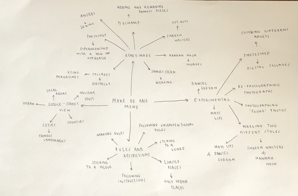
This mind map reflects the ideas I have for my final piece. I would like to take inspiration from these artists and create pieces which I am proud of.


I took some inspiration from Höch as she works with woman in her pieces so I wanted to incorporate that into my piece. Using the theme of woman and urban landscapes, I created a collage. I like this collage however it would be better if I added faces and made the collage look more discrete. I would like to take inspiration from Walters, and layer cut out face on top. I would like to use this collage as a background and further develop this piece.
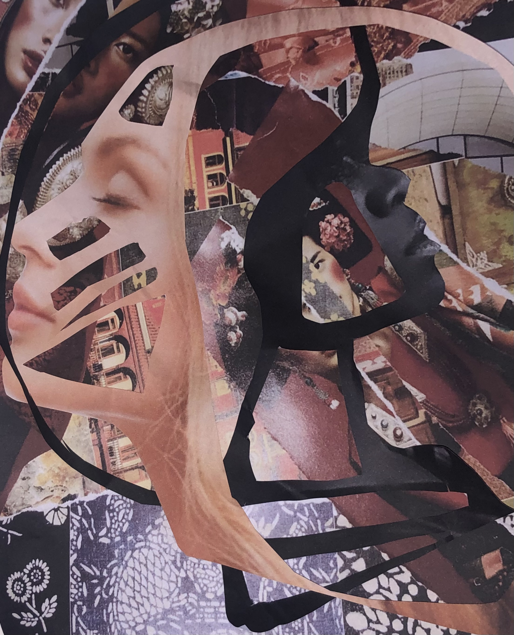
This is my finished collage. I am really pleased with how it turned out. The two photographs cut out inspired by Walters helped elevate my work. I like how the background is a collage as it helped the faces be more seen. I am happy that I carried out with my collage rather than starting a brand new piece all together. I like this outcome as it was not planned but it came out really well. This piece represents the patriarchal society we live in and I used women to show how they are over-sexualised and are seen for their beauty rather than the qualities that make them unique. The use of the collage brings a dainty and a work environment, and the use of the cut out heads displays that woman can be what they choose to be and they shouldn’t have to be confined to the rules of society.
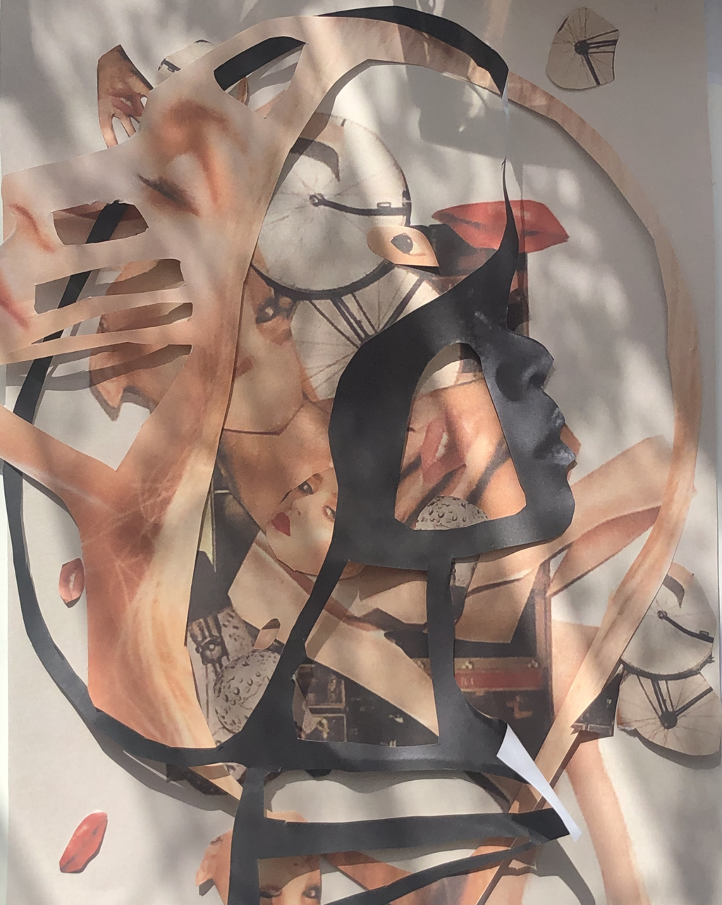
I used the collage I made inspired by Höch to produce a new piece. I layered the piece that I previously made and I like how my final piece turned out. I like how all the colours are muted and fit together except for one image in black and white. However this makes that aspect stand out. Overall, I am quite pleased with my piece. I found that this piece worked better than the other as I took the colour scheme into consideration.
