Edges is a topic which has a range of ideas and concepts. Everywhere edges are seen, whether that is at home or your surrounding. Edges has no boundaries. You can choose where it is, what the image is of, or how image is taken.
Depth - It is used to produce an image containing details, such as: the foreground, the background, the framing of the image.
Composition - Arranging elements in a photo to suit the main purpose of the image.
Cropping the image - Cropping/cutting out something if unnecessary or if it would ruin a picture.
Focus - The edges of the image could be blurred depending on the aperture, this would mean that the subjective focus would be drawn to.
Framing - How you frame the image determines how effective it is as it has an impact on the sculpture. This would also impact how the viewer sees the image.
Paper Analysis
What are their similarities and differences?
Francis Bruguière |
Jerry Reed |

This artist used paper that he cuts it into abstract images. Francis manipulated the paper and light into creating a image consisting of different patterns of form and texture because of this he created an unusual piece of work.
|

This artist uses paper as a structure and gives it volume by creating shapes, such as ovals and triangle. He creates the shapes by manipulating paper and light.
|
|
The similarities between these artists images it that:
|
The differences between these artists images is that:
|
Artists’ work


Chosen Image To Re-Create
|
I have chosen this image by Jerry Reed as an image to recreate because even though it is very simple, its quite effective. The equipment i would use to recreate this photo would be:
|
|
Chosen Image to Research

|
I chose this image by Francis Bruguière to research as it has more dark tones than light and the light source seems to be natural. Majority of the edge of the photo is dark and the centre is where most of the light is.
|
Finding The Light
|
We were given two photographs, one being by Jerry Reed and the other by Francis Bruguière. We were then told to recreate the images by using HB pencils, and we had an hour to do so.
One of the reasons why we did this task was because everyone perspective is different. We also did this task to see how we saw light and dark. Also when looking at image for longer, you observe how the image was contrast. Another reason why i think we did this task was to show that in order to be a good photographer you'll need to find the light source and place your main subjective point in a way. The difference between these images was that the top image was more simple whereas the bottom image had more complexity. The bottom image was more abstract. On the other hand, they both used tone and shades but in different ways. |

|
Paper And Light


WWW: |
EBI: |
|
|

|
This photo is my favourite because the colour picks up well and makes it the image seems like something dangerous is going to happen. This photo is also my favourite because of the angle, you don't really know where the paper starts and stops.
|
Chatterboxes


WWW: |
EBI: |
|
|
Mirrors


WWW: |
EBI: |
|
|

|
Out of all the mirrored photos me and my partner took this image is my favourite because the reflection of the mirror and the area the mirror is located both complement each other as different tones and shades of yellow is incorporated in both.
|
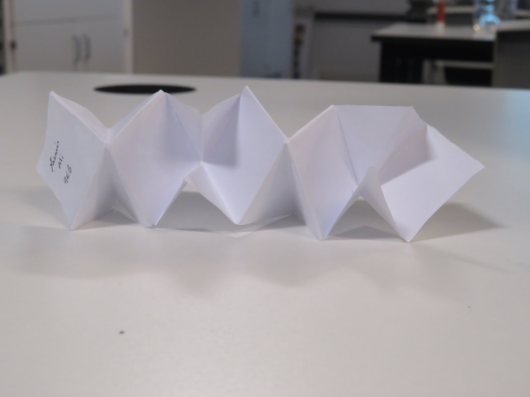
Concertina Book
A concertina book is a piece of card or paper that has been folded in a way to form a book. It can make different shapes depending on the size of the paper/card you use and how you fold it. A concertina book can be interpreted in different ways depending on how you would like to represent your images. Concertina books are made to showcase your images of a theme all in one place.
|
|
|


Concertina Book Drafts


I made different variations of a concertina book to find which one would be the most fitting for my theme and which one I felt would interpret my images in the way I wanted them to be told.
|
Out of all my drafts, this concertina book is my favourite. The reason is because it contains different shape, which means the photos I include inside can be cut into another shape to add into it. Another reason why I liked it the most is because it's different to the rest of the concertina books I made, which made it more unique.
|
Concertina Book Final Draft

In order to see whoever I would stick to the idea of my concertina book being like my draft, I made two. One of which was bigger and had more in dept photos. I liked the concept as a part of each photo was missing, which allowed the viewers mind to wonder about the missing part and what it was of.
Concertina Book Final Product


I did my first concertina book in black and white so it had a variety of tones and so it had a dull mood. I then made my second concertina book in colour so those viewing it could see it like how I saw it, rather than how I portrayed it to become. I am happy with the results of my concertina books because the images all fit together. Another reason why I like my concertina books is because they have a different shape compared to most concertina books, which makes it more intriguing and adds complexity. One way I could improve my concertina books is by making sure all the lines line up with each other. I could also improve by sticking the paper on cards so it doesn’t get crumpled.
Paper Abstraction
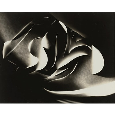
Francis Bruguière - Cut Paper Abstraction c. 1929
I think that Francis' image was made by manipulating paper using curved lines to create abstract images. His images are more complex as they have more tones and more shapes. Francis uses more darker tones. It seems that he uses natural light sources and the light source comes from the side of the image.
|

Vjeko Sager - from the series Antimatter, 2008
I think that Sager's images were made by using hard paper and cutting out straight lines to create sharper shapes. This artists image is more minimal and is simple as his images uses more light tones towards the centre and more darker tones towards the edges so it doesn't feel overcrowded.
|
I prefer Francis’ work. The reason is because even though it is quite complex, it feels more homely than Sayer’s. It also has a wider range of tones. Another reason why I prefer Francis’ work is because of the dark tones and curved lines, it adds an element of comfort.
Assessment


I chose these images as they all interlock in a way. I also chose these images as they can be interpreted in different ways. As I looked more into the photos, the more questions I had. Questions like: Why did the Photographer pick these areas to photograph? What struck out to the photographer when taking these photos? What allowed these images to make the final cut? What did the photographer find interesting when taking these photos?
These images show that anything can be photographed to show memories and moments so you won't forget them. It also shows that no matter where you are, you can take photos, you just have to be at the right place, at the right time.
These images show that anything can be photographed to show memories and moments so you won't forget them. It also shows that no matter where you are, you can take photos, you just have to be at the right place, at the right time.
Re-photographed Photos


When I was deciding which images to chose, I looked at the level of complexity. I liked these photos the most out of bigger pile of photos, as these images had more character than the rest. I also liked these images as they weren't too bold. Also the other photos either had one colour or had too many objects that i could not tell the subjective focus.
When I was uploading the images to my page, I decided that I would upload it individually as that way all the images could be seen as different rather than all together.
When I was deciding where the images would be taken at I chose the places that they would have fitted in the most, and places that wouldn't take out the simplicity of the photos. Many of these images were taken outside as the outside had the most fitting places. When taking the images i focused on the angles the photo would be portrayed in.
The strange thing about photographing photos is that you'll never know the possible outcomes of the photo unless you try it. Another strange thing is that your taking another artists work and making it yours by adding your own touch to it.

|
This is my favourite photo because even though it simple, its different to the rest of the photos I had taken, which gives the photo an element of uniqueness. Also the area I took the photo, and the photo itself both fit in well with each other due to them both having the same colours.
|
Photo-Sculptures


When making my photo-sculpture I ensured all 5 of the photographs I had chose would be incorporated in the sculpture. At first I didn't like the end result of my photo so I kept making changes until I felt like it was good enough.
WWW: |
EBI: |
|
|
My Photoshop Adventure


For this task, we photoshopped our sculpture onto an area of Thomas Tallis school. In order for it to get to its final product, I used the following steps:
- Drag your first image onto photoshop.
- Drag your second image onto photoshop
- Select the polygonal lasso tool.
- Cut around your shape.
- Copy it by pressing command C.
- Paste the copied image onto the Tallis landscape and re-size it to your taste.
WWW: |
EBI: |
|
|
|
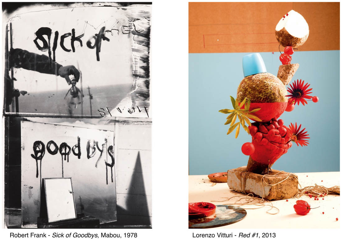
Robert's image has a sinister atmosphere as its a dull photograph. His photo seems to be two images in one. The top half containing an arm, which is in a form of a portrait. It also contains a small skeleton figure and a cross in the background. It has 2 words:Sick Of -which seems to have been written in a blood-like texture. The bottom half seems to consist of two mirrors, one behind the other. The mirror at the back has goodbys -this has also been written in the same texture. The image seems to contain a date (11.01.18) and also a word, which could possibly be a name, (Mel). This image is in a portrait format but consists of 2 landscape images.
|
Lorenzo's image is more aesthetic as it has bright colours: orange and blue. It consists of fruits(still-lives) and a variety of sculptures, such as: a brick and a rose. This picture is in a portrait format. It seems to have been split into 3 sections, all contrasting each other. As it is very colourful, it has a happy mood.
|
The similarities between these images are:
The differences between these images are:
- They both are in a portrait format.
- They both consist of different sections.
- They are both abstract images (cannot tell what they are at first glance).
- The meanings of these images are on the surface.
- Both of these images are mysterious.
- Both images have areas of the photo which have straight edges.
The differences between these images are:
- Robert's image is in black and white whilst Lorenzo's image is in colour.
- Robert's image consists of landscapes whilst Lorenzo's image consists of still-lives.
- Robert's image consists of mirrors whilst Lorenzo's image consists of fruits.
- Robert's image is in an open landscape whilst Lorenzo's image is in a shallow space.
- Robert's image consists of straight edges whereas Lorenzo's image is a mixture of straight and curved edges.
- Roberto's image leaves us feeling sad whilst Lorenzo's image leaves us feeling happy.
If I could ask Robert questions, I would ask:
- Why did you section the photos?
- Why did you make them different from each other?
- Was 'goodbys' spelt wrong on purpose? Is there a meaning behind it?
- What were the challenges that came with the photo? (Balance?, What angle to photograph from?)
- How did this idea come in the making? How did you think of it?
The relationship between a photo and an edge is that the world is 3D and a photograph turns it 2D. A photograph gives it a sculpture and an edge it never had before.
Looking Down
For this task, we were given 20 minutes to take photos of objects beneath us.


WWW:
|
EBI:
|

|
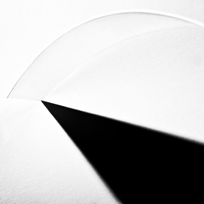
Out of all the images I had taken, this one was one of my favourites because it had different layers of papers. It was also the image I liked the most as it was different from the rest.
|
|
This is also another image that I liked. The reason is that the shadow on the floor makes you question which angle the image had been taken in. Also the light and dark tones contrast each other.
|

|
Paper Sculpture
For this task we were given paper to create a sculpture. I created shapes with sharp lines as they created a base.
First take of the paper sculpture


WWW: |
EBI: |
|
|
Re-takes
I re-took the photos at a different angle and ensured that none of the paper sculpture was cut off by the framing. The background complemented the sculpture as yellow wasn't included as a colour in the sculpture.


WWW: |
EBI: |
|
|
Random Images


WWW:
|
EBI:
|
|
I like this image because you can't tell where the start or ending is. Also the different thickness of the tree makes the background seem duller as less light is allowed through.
|

|
