LANDSCAPES
"All the visible features of an area of land, often considered in terms of their aesthetic appeal"
When you look over an area of land, the features you will be able to see are buildings, mountains, rivers, forests, and etc. A landscape picture contains a view, typically of nature: whether that's mountains, beaches or forests. Landscapes are either filled or quite plain and empty. The format of a landscapes picture is horizontal. The colours of landscape images are either light-toned like pastel colours or more dark-toned. When I think of landscapes, I tend to think about: the format and framing of the picture; what the landscape is going to portray; the location of the photograph; whether it's a painting or photograph; and the camera and how it is positioned. The word's I tend to associate with landscapes are: the view; mountains; forests; the countryside or a farmyard; the beach; trees; nature; and the scenery.


These are some of the images that show up for landscapes, they are all light-toned and are about nature. Majority of these images contain an aspect of greenery, whether that is trees, grass, or hills. Two of these are paintings, they contain features that are associated with landscapes. For example: nature, the picture being horizontal, a forest, and a mountain.
|
Urban landscapes:
|
Gritty landscapes:
|
|
|
|


My ideal landscape would include greenery such as: hills, trees, hills, and flowers. It would also include a mountain perhaps in the background. My ideal landscape would also include something that reflects the view, this could be a lake or a river.
LANDSCAPE ART
|
|
This video talks about how landscape art contains politics. It talks about how every land has a story and a history. The history of land contains who the past owners of the land were and how it has changed. This can be change to it’s appearance, for example, how it looks now compared to how it looked in the past.
|
LANDSCAPE ART ARTISTS
HÉLÈNE BINET


Hélène Binet is an architectural photographer. She uses an analogue camera and film and then handprints her photos into black and white. Binet works a lot with straight and curved lines; she also works a lot with angles. Her work allows for the architecture to be personified in a way, as it tells a story and gives the buildings characteristics, for example, moods. Her photos allow for tones and the gradients to be seen due to the black and white film.

|
Her images reveals the light, space and form. In this photograph. Binet seems to use a lot of light tones of the colour grey and she makes the building the main subject (focus). She frames her work, so majority of the architecture is seen. However, as she uses an analogue camera and film, we don't know how the location looks to the naked eye. We have an element of surprise, as we still see and capture the architectural element of the photograph however we are left questioning the history of the place and what significance it has to others, such as Binet. As colour is taken away from the photograph, we see the subject from a different light. We try to see and grasp the dimensions and aspects of this building which makes it different and eye-catching. The use of the colour grey can be said to feel quite sad and melancholic. However it can also be said to feel like a sense of relief as grey represents neutrality and balance. The different tones were created from the use of the black and white film, because rather than using colour film to showcase the vibrance, the different tones displays the different shades and vibrancy.
|
RESPONSE


Inspired by Hélène Binet, I took some photographs. I like these photographs and i edited them into black and white as her photographs contain a lot of atonal tones. To make my photographs more inspired by her, I’ll take pictures from further away, so the framing shows the whole architecture, and I’ll also ensure that the photographs show more details.


These are another set of photographs, I have taken inspired by Binet. I like these photographs more than the first as they show the whole architectural elements rather than parts of it. I really like these photographs I took as they are my own take on Binet's work. I like these photographs however I still feel like they do not reflect Binet's style. Her photographs are more close up than these ones and they also display very structural buildings that work with more geometrical shapes. I incorporated the black and white theme into my photographs and I took photographs that displayed a whole building. If I could take more photographs, I would love to take images of more obscure looking architectures. I think the reason why I found it hard to recreate Binet's style is because she uses an analogue camera and film, whereas I am more restricted as I am using my phone's camera.
GUY TILLIM


Guy Tillim is a South African photographer. He focuses his work on the troubled region of Sub-Saharan Africa. I like his work as it’s quite urban as his work documents life in troubled regions. Tillim’s work uses a lot of black and white however some of his photographs contain colours. He captures the beauty in areas many won't travel to.

|
This photograph can be seen as a reflection on the legacy of the idealistic nationalism and it shows the life and beauty in troubled areas of South Africa. The photograph captures the building as quite old and grimy as there are a lot of tears and scratches on the wall. This allows us to infer that this building held a lot of life. Tillim can be capturing buildings like this to suggest that there was a history in every building we see. However, this building makes me feel quite sad as every area of this building contains a story and a background, which can only be told by those who lived it or witnessed it.
|
INITIAL RESPONSE


These are images I took inspired by Guy Tillim. I do like these images because Tillim's work is more based around architectural structure and the inside of buildings. His work is based around sharp lines and everything is connected in a way. To make my photographs more inspired by him, i’ll ensure that the photographs are taken more closer up and that the main subject is in the middle.


Even though my last images that I took were said to be inspired by Guy Tillim, they didn't really reflect his style as his work has the focal point is towards the centre whereas mine was more towards the sides. Also one of the main reasons I didn't tend to go back to these photos was because it wasn't my style as I tend to take lifestyle photographs rather then architectural photographs. Also my photographs were very zoomed in whereas Tillim's photographs weren't and his showed the whole space rather than a part of it. I decided to take more pictures in his style. I tried to incorporate most aspects of his images in my images. For example he takes photograph that consists of sharp lines and some of his images is zoomed out so the whole area is seen. I like the last three photographs, as the include both natural and architectural elements. I really enjoyed taking pictures inspired by Tillim, as I began to look for more straight lines and places that combined greenery with buildings.
DAFNA TALMOR
"Constructed Landscapes transforms colour negatives of landscapes initially taken as mere keepsakes through the act of slicing and splicing. The resulting photographs allude to an imaginary place, idealised spaces or as Foucault states, “a virtual space that opens up behind the surface".


Dafna Talmor's work originally consisted of interior spaces, however she soon stepped out of her comfort zone and started to take photographs using exterior spaces. She became aware of the lack of limitations as well as the combinations and possibilities she can take her work in. Talmor took photographs of places she visited with no purpose, simply because she wanted to remember where she went due to her desires. As Dafna Talmor took this photographs with no plan or result in mind, she felt as though she needed to find a purpose from the results. Due to her feeling this way, she felt as though the rolls of film were disappointing and she left them as negatives. Even though she had found a limitation and felt frustrated, she had been led to the idea of merging different areas that held a personal impact to her to form and create an idealised landscape. She incorporated the place she was born, the place she was raised, the place she lived, and the place her sister lives (Israel, Venezuela, The U.K, and The States). "The act of physically merging landscapes from different parts of the world refers to the transitional aspect of our contemporary world in a metaphorical way...Constructed Landscapes is interested in creating a space that defies specificity, refers to the transient and to the blurring of space, memory and time." With her work, any interpretation can be made. For example, one could infer that her work transcends from a particular place that is filled with memories and thoughts to a space that reflects an area of emptiness, which has no subject or focal point, which becomes universal.

|
To create her work, Dafna Talmor starts off by removing the unwanted aspects of her negative film, she does this by using a scalpel. The removal of some aspects can be perceived as the destruction of land and nature, this can be a political and environmental metaphor. Due to permanently removing these aspects "an irreversibility comes to the fore which is not present in current digital manipulation where one can ‘undo’ an action repeatedly and maintain an original ‘master’ file".
I really like her work as it unique. It is hard to guess where her photographs had been taken. Also even though all her negatives undergo the same process, they all turn out different. Some look as though they have been melted and some look as though they are jigsaw pieces fitting together. |
This video talks about the artists process to making her piece 'constructed landscapes'. She talks about the process she used and how she came about to develop her work.
SLIDE MANIPULATION
We were given a slide created by another artist and we were asked to refine and add to them. I didn't like this outcome as the piece did not come out like how I wanted to. I should have played more and like cracked the actual slide or added more colour because this outcome looks blurry and almost rushed. However, considering this was my first time working with slides, I think that it was a good starting point. If I could do something to improve my creation, I would experiment more with the actual slide and cutting aspects out, so parts of the photo can be left to the viewers imagination.


CORINNE VIONNET
"We travel, we see a monument, we take a picture. Framing sites of mass tourism in our viewfinders, we create photographic souvenirs that are integral to the touristic experience. Conducting keyword searches of famous monuments in photo sharing web sites, Swiss /French artist Corinne Vionnet culled thousands of tourists’ snapshots for her series Photo Opportunities. Weaving together numerous photographic perspectives and experiences, the artist builds her own impressionistic interpretations – ethereal structures which float gently in a dream-like haze of blue sky."


In these images I can identify famous monuments, such as: The Big Ben, The Colosseum, The Taj Mahal, The Leaning Tower of Pisa, The Pyramids of Giza, and many more. I think these images have been constructed from two or more landscapes. I think that the artist takes or finds images from different angles and areas of the same monument and then weaves them together. I think Vionnet wanted to construct images in this way to show them in a new light and to show the different ways people can interpret the same monument. For example, one might take a photograph of a monument from straight ahead to only capture the monument and someone else might take a photograph to frame the whole monument and its surroundings. When looking at Vionnet's constructed images, one might question 'how do we determine the optimum spot to photograph monuments?'. To create her work, Corinne Vionnet looks at photographs of the same landmark to see how people capture the monument and collects many of them to layer together. She collects images from different days; different times, e.g. night or day; and different seasons. She then chooses an area of the photograph to keep the same so it is the meeting and focal point. This allows for all the images to line up together.

|
I chose this image of St. Basil's Cathedral. This image looks like many photographs were taken from different angles of this monument and it was then incorporated together. I found this image interesting as it looks like they were layered together, which could be why the image looks blurred. I also think Vionnet could have taken found photographs of this landmark taken by different people and then layered them together. This could be why certain aspects of the photograph are the same.
|
To create her work, Corinne Vionnet looks at photographs of the same landmark to see how people capture the monument and collects many of them to layer together. She collects images from different days; different times, e.g. night or day; and different seasons. She then chooses an area of the photograph to keep the same so it is the meeting and focal point. This allows for all the images to line up together.
CHARLES WILKIN


Charles Wilkin's work consists of images and shapes placed over landscapes. I think that the shapes have been carefully constructed over the landscape as it follows the shapes and lines of the background. The colours of the placed images contrast the background as they look like they are made from different materials and they also consist of different patterns. His work seems as though it reflects a state of mind, for example, the different colours could represent the different emotions and the different cultures our world consists off. The use of layering causes for changes to certain aspects which allows us to put a new perspective on life and our surroundings. His work could be said to portray the unknown as he uses colours which hides the aspects that displays the beauty that has been almost hidden and over-clouded by our thoughts.


Using images of photographs I had on my phone, I printed them out in black and white to create a background for me to layer materials onto. I like these photographs as they all contain architecture, which I found was a huge aspect in Wilkin's work.


I like my first response more than my second as I played a lot with inactivate objects as well as materials. With the second response I wanted to make it look like the face was dropping but it didn’t really turn out how I wanted it to. Overall, I am happy with how I experimented and how I used my own photograph as a background and layered with found photos. Also the lighting in the first photo was good whereas in the second photo it looks quite white and edited.


I used the black and white photograph from before and cut out circles using a scalpel. I liked how it turned out, however it would have been better if i cut the circles to be the same size. I also could have improved on using different photographs for the whole piece. But what is most important is to try out new styles and ideas, so I am glad I experimented. I was inspired by the artist Fong Qi Wei as he creates work using different colours and shapes.
LANDSCAPES

LANDSCAPES LOCALLY


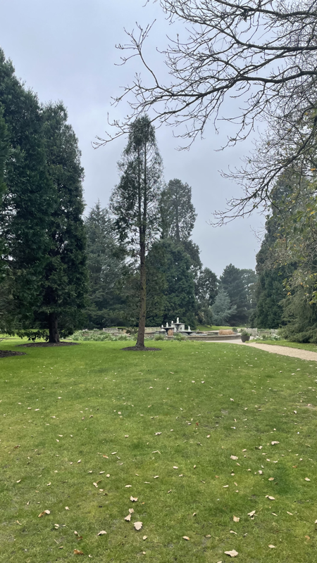


These photographs were taken from different areas and locations. Some are natural landscapes, some are urban landscapes and most of these photographs are open landscapes. I like how these photographs all contain similar and vibrant colours. I like how the two images that have sunsets look as though one is a magnified version. Each photograph is taken from places that I have memories from. I took these photographs without thinking I was going to use these, as I like to capture life and places whilst I am out with family or friends.
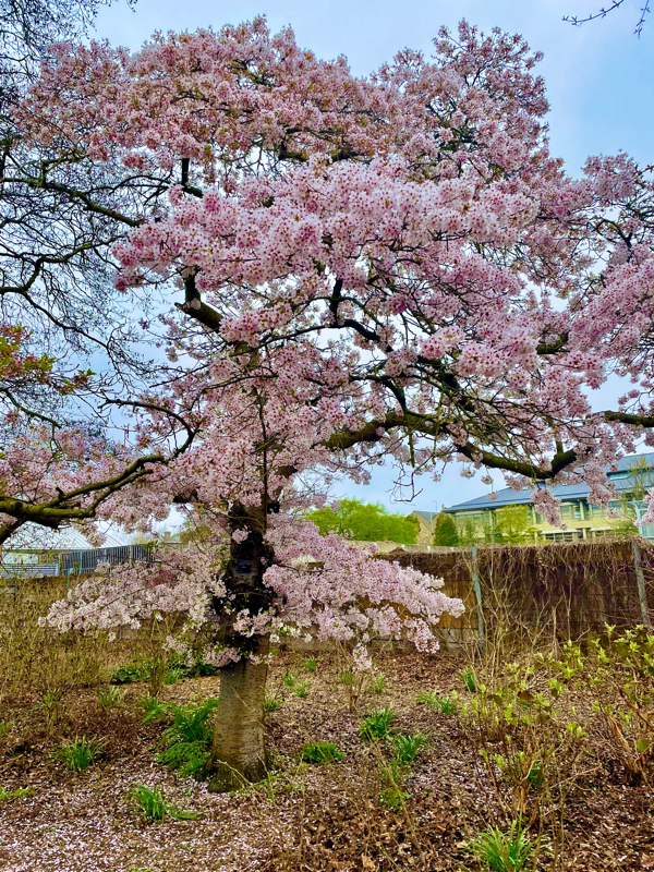
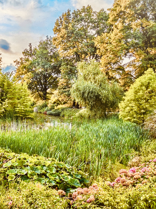
NATURAL LANDSCAPES
Around the school, we took photographs of different natural landscapes. The photographs wasn't allowed to include any buildings or any aspect that wasn't apart of nature. I like the picture of the stream with greenery surrounding it because it isn't something that is associated with school. However, as there was not a lot of time to take these photographs, they all look very similar and from a similar angle. Overall, I like the consistency of the colour green throughout each photo, as well as the different plants and trees.


NATURAL LANDSCAPE ARTISTS
AWOISKA VAN DER MOLEN


Awoiska Van Der Molen is a Dutch visual artist. She started off taking photographs of urban landscapes and slowly began to drift into natural landscapes. When taking her images, she focuses on only including natural aspects that have stayed the same and been unspoiled, she does this as the result of the urge to go to our origins and backgrounds. After she takes her photographs, Van Der Molen edits her photographs into black and white and this allows for her photographs to become abstract representations of landscapes.
When Van Der Molen takes her photographs she dissociates and removes all elements of distractions, this allows for her to be fully aware of her surrounding and take her view in. She believes that "the human body possesses some deep internal memory, an unconscious instinct, that recognises when we get closer to the kind of place from which we stem: the uncorrupted territory of nature". Her belief of this is what she visualises when she takes her photographs. This also contributes to her urge and thoughts of wanting to return to the location these images are from.
When Van Der Molen takes her photographs she dissociates and removes all elements of distractions, this allows for her to be fully aware of her surrounding and take her view in. She believes that "the human body possesses some deep internal memory, an unconscious instinct, that recognises when we get closer to the kind of place from which we stem: the uncorrupted territory of nature". Her belief of this is what she visualises when she takes her photographs. This also contributes to her urge and thoughts of wanting to return to the location these images are from.


In response to the artist, I used photographs of landscapes that I had and edited them into black and white. I like these photographs as each place holds memories and meanings. I like how the photos were originally bright in colour and full of life, but the use of the black and white turns the vibrancy into tones. It also allows me to look at life from a new point of view, as it still holds the same meanings with or without the colour. I took these not knowing I was going to use them for my website, and I like they all these photographs I can look back on and reflect on the emotions I felt at the time.
LUKE SAXON
TRUE NORTH
"A series of images that, for me represent the North West of England."
|
|
Luke Saxon's photographs captures a mundane aspect of life however the vibrant colours allows for the series of images to have a lively aura and atmosphere. Saxon’s photographs cause us stop and admire his work as they capture the reality of life and he doesn't alter them in any way. As majority of his photographs are bright, it allows for us to look at life from more positive aspect and to notice and appreciate the small things. His photographs brings a sense of comfort and contentment as his photographs capture life as with beauty and peace. His pictures ext
|


THE SAME BUT DIFFERENT
"Exploring the contrast of ethnicity and class in contemporary Britain, ‘The Same But Different’ is a series of collaged photographs that depict cultural diversity."
|
Luke Saxon merges two different photographs together to create one. He does this by following the shape and lines to help incorporate both images together and this allows for them to link together very well. The only aspect that makes me question his work is how these photographs depict cultural diversity. I think his work has a lot of diversity visually but it doesn't contain cultural difference. Despite this, I really like his style of work as it allows us to look at places from a different view and light. He takes his photographs at places he has a connection with, whether that's from his childhood or his teenage years.
|
|


|
These two photographs combined create an abstract atmosphere as it looks like the cat's bones and fragments have been left. The two images looks as one as it has a continuous line and shape. The plastic can be said to have animalistic like features, for example: arms, a face, and a body. Also the lines of the floor have been continued as well. The division between the rocks and grass has been shown by the metal wire on the other side. I like this photograph as it takes a creative and unusual take on everyday aspects. For example, the cat has been made to look electrocuted on the second half of the photograph as the wires and the plastic combined creates this atmospheric look.
|
RESPONSES
I liked Saxon’s work ‘True North’ as the photographs seemed very simple but they showed everyday life. I found that normally with artists, their works were quite extravagant and they did not reflect my style. However with Saxon, I naturally felt gravitated towards his work.


I like these images as I took photographs of places that had a lot of natural aspects. I felt like my phone camera toned down the vividness of the places, so I edited them using VSCO to become more saturated. I like how they turned out. The third photo seems quite unrealistic and it seems like it’s from the internet but I like the style of these photographs.


I also wanted to do a response based on lifestyle photographs as I felt like the first set of images were more natural and these did not fit the same colour scheme. I like how these photos turned out. They seem a bit dull and dark but I think they capture the evening time very well. I edited these photographs using the editing section of the camera roll.

|

|
These are another set of photographs I did in response to Saxon. His series 'The same but different' combined different photographs that had the same shapes or lines. For the first photo, I like how I combined two different buildings however as they did not have the same curve it seemed very edited and fake. I wanted to redo this another response like this so I create on based on straight lines. This was the second photographs. I like how this response turned out more than the first as I combined two distinctively different photographs. I combined a wooden piece from a greenhouse and a tree. I really like this photograph and I think that it reflects Saxons work a lot.
COLLAGES


As a class, we all created a collage by all putting up a photo or two. I then took different photographs taken by different people and rearranged them into a collage I liked. I focused on using photographs with the same colour gradient and similar shapes as they linked and flowed together nicely. I liked how the images look as though they are one and they are taken from the same location. As Saxon creates collages by following the lines and shapes, I used the same approach. I like how my outcome turned out, however I don’t think I followed his ways very well as some photographs don’t have the same lines but they link through their tones. Overall, I like how my collage turned out and I learnt to be more open when creating pieces.
DISTORTED IMAGES
WITHOUT PLASTIC FILM


I took photographs around the school focusing on nature. I like these photographs however they could be better if i took some of them further away. I particularly like the photograph of the two trees meeting as it looks as if they are interlinked with one another. I really like the last two photographs as it seems like they are reconciling together and it shows the beauty in nature.
WITH PLASTIC FILM


The images I took using the plastic film became blurred and with most you can't really see anything. I prefer the pictures I took without the plastic as even though you can get an idea of what the pictures are about, it seems as if the camera wasn't in focus. Although, the plastic caused for the photograph to look quite dull and cloudy, it allowed me to try a new photography style. I think it would have been better if these photographs were taken on a more sunnier day, as they could have made the photos more brighter and less muted.
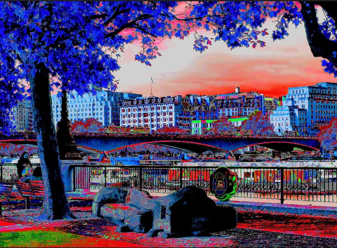
LONDON LANDSCAPES


These are two different types of landscapes I took of London. The first six are urban landscapes. They all contain buildings, whether that is a bridge or houses and flats. The last three are natural landscapes. They all contain greenery, such as trees, grass and bushes. The natural landscapes contain more colour and vibrancy than the urban landscapes. I would like to take photographs of less generic places and more abstract locations as this would give my photographs more character.
DEVELOPING MY IDEA
When creating my piece, I was inspired by Corrine Vionnet as she takes photographs of the same location and layers the images together. I took photographs from different angles of the same location with the idea that I was going to merge them together by using layering. I used photoshop to layer my images together and changed the opacity so that all three images were seen rather than the last layer only.
THE PROCESS
|
|
Using Photoshop, I uploaded the three images I wanted to use. I fitted them onto the page as they were all different sizes before hand. I then went onto each photo separately and changed the opacity. This allowed me to ensure that aspects from all three photographs were seen.
|


|

|
I like how my images turned out. However to improve them, I can make the opacity higher so the images can be seen more and the final photographs has a stronger atmosphere and mood.

|
I like how my final outcome looks. The photograph has a daunting and an eerie atmosphere, this could be due to the pictures being quite dark. Although I used a similar method to Vionnet, my final image looks different. This is because Corrine Vionnet uses photographs taken from the same area, with the focus being slightly shifted. This allowed for her final image to look more like a blur whereas my photographs was taken from different locations and angles of the same area. This allowed for my final image to look like different aspects of an area combined. However, I like that although J was inspired by her, my photographs were quite different.
|
FURTHER DEVELOPING MY IDEA
For my next response, I wanted to make the outcome look like it has been blurred. In order to do this I took pictures of the same landscape but each time I took a photograph I slightly shifted the camera. This allowed for me to have a few photographs of the same landscape but with the focal point at different places. This is similar to what the artist Corrine Vionnet does.
THE PROCESS


Using photoshop, I uploaded three photographs that I wanted to use. These photographs were from the same location. I fitted the image onto the page so the were all the same size. I then changed the opacity so that each layer can been seen. This then allowed the photograph to have a blur. I used the same method for my other photograph.

|

|
I like how all my outcomes are portrayed and made and I like how the process is really simple but you can add your own style and ideas to refine previous work. To develop my idea further, I can take images of the same location at different times of the day as well as different days so the image looks more together. For example, I could take pictures of a landscape for a period of time. I would like for the photographs to be taken from a similar angle to each other, so it looks as though the picture has shifted slightly. Using these images I'm could layer them together, but leave a focal point. This will allow for the final image to look like a blur whilst having a clear area.
DEVELOPING MY IDEA
For my next idea, I wanted to focus on light and how it could refract to give off different photographs, and how light can control the way we view things. With all of the different outcomes, I could then make them smaller and incorporate them together to make an outcome, so it's like a grid. I had the idea to print out a photograph in different hues and colours and reconstruct the image.


I used my idea however rather than focusing on light, I focused on the areas of the picture that I wanted to keep the same colour. I like how my outcome turned out. I used different shades of blue and green to create one image. I cut out the squares to be around the same size, however I kept some parts a different size. Although, this is a simple piece, it draws our eyes in as the different colours display the view in a different way.
CREATING A PIECE
BRAINSTORMING IDEAS:
- Making a collage photograph with different photos
- Making a photograph by cutting out elements from different photos - reconstruction
- Using a transfer technique - acetone.
THE PROCESS


I used different aspects from natural photos and combined them together to create one piece. I didn't like how this turned out as it looks very clustered together. In order to improve this image, I could use different landscape photographs and incorporate them together. For example, urban and landscapes. I didn't like how my product was turning out so I decided to take a different approach and start a new piece.
THE PROCESS


MY OUTCOME
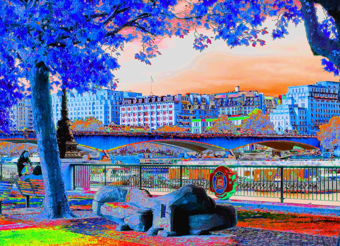
I like this outcome as the image looks fictional. This can be due to the use of vibrant colours, like blue, red and green. The use of black and white allows for the image to not look overpowering as it keeps some of the original features. When creating this piece, I didn't know how it will turn out as when I was changing the hues and exposure level, I couldn't see the image and how it'll affect it. I would like to create another piece like this. However, it could contrast this image, for example, I could use the complementary colours of the ones I can see here. I also like how in the original image, the atmosphere of the location was quite dull and gloomy. There were clouds covering the sky and the only colours seen in the image were greens, greys and browns. However, the edited image allowed for the colours to be changed to something more lively and vibrant. For example, the peachy colour of the sky helped the sky feel inviting and warm. The use of the saturated picture caused for the picture to feel like a magical place.
I like this outcome more than the first. This image seems more vibrant and uplifting than the other as the colours used for this image are quite light and allow the image to be lively. To continue with this piece of work, I would like to create a concertina book using these over-edited photographs.
ADDING TO MY PIECE - PART ONE


Using the edited photographs from before, I cut out sections and created a layered version. I liked the use of geometric shapes, however it would be better if more aspects were cut out or if the other image was another colour.
ADDING TO MY PIECE - PART TWO


I would like to display over edited pieces, so I created other pieces using the method I used before. I like the first image as it contains bright colours and it feels very muted in comparison to my previous image. The second image gives off a different atmosphere altogether, as it feels vintage and less vivid. The colours bring a sense of nostalgia and I like how all of them are very different to one another. I would like to create around ten pieces all together so I can display it in a similar way to the artist Chris Engman - variations or Corrine Silva - Garden State.


I really like how these photographs turned out, as it made the pictures have more character and definition. I like how some are less brighter than the others as this helped for this images to link together once I showcased them. I like the over use of the saturation as this allowed for the photographs to still feel warm, however with some photographs I changed them into more cool tones (like purple and green). I feel like the use of those colours gave the photographs more character and made them feel almost out of a cartoon or anime. In particular, i like the second, fifth and seventh photos because they seem very sophisticated and visually appealing.


I like that I wanted to showcase my work, however it would have been better if I took the photos from an angle further away to show how it looked. The last two photographs was my plan on how I was going to display my work but I realised that the length and the width of my photos were not all the same. As for some images I printed them out landscape but for the others I printed them out portrait.
LAURA PLAGEMAN


I like Plageman's work as she layers different photographs onto each other by cutting them out into different shapes. Her work contains a lot of colours and all of the images link very well together. I also like her work as they all relate to nature.


|
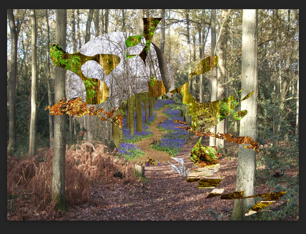
I decided to respond to the artist without researching first I like how my work turned out but I think it would have been better if I created my work using a scalpel and printing out the images rather than using photoshop. I like that I created random shapes and I used a lot of random photographs. I also like that includes a variety of shades of green and that it is quite vivid. If I could improve this photograph, I would like to combine different genres and experiment with a combination of found photographs and my own.
|
JACQUI KENNY


Jacqui Kenny is an agoraphobic photographer. Kenny to avoids traveling or venturing into the outside world, as agoraphobia is an anxiety condition that causes for a panic attack and makes one feel as though they are trapped and can't escape. Therefore to combat her struggles of traveling the world, Jacqui Kenny uses google street view. When looking at her photography series 'Agoraphobic Traveller', I noticed that all of her photographs were of isolating places. All of these locations consist of small urban spaces, that are free from noise and have pastel and light tones. Her images are feel as though they are still going through changes and they feel ethereal. The reason is as the places are quite empty and have little to nothing going on, the colours of the architecture and the outfits of the people bring life and vibrancy to the photographs. Kenny's photographs also seem to link, whether that's by the colours used in the location, or where the architectures are located. With her photographs, it's hard to tell where these photographs have been taken in, as they all look similar but have a few differences. I think that despite the her unability to go outside, Kenny still finds a way to overcome her hardships.
MY RESPONSES


As I was inspired by Jacqui Kenny, I focus my photographs on areas that were very similar but had their own aspects. My photographs had a similar colour palate, as all of the photographs contain pastel colours. I like these images however they all look as though they have been taken in the same country. These images were focused in Mediterranean and African countries. I thought that countries in these location would all look very similar as they all have the same climates. As all these locations have very hot weather, their architecture are very light-toned so they reflect heat. These photographs feel quite empty as there is not any aspects which look welcoming. These images feel isolating as although people may be living in these areas, it looks as though they are keeping aspects to themselves. This can be seen as a positive thing as it means that these areas don't feel cramped and occupied.


I edited these photographs so the images were much brighter and looked more like Kenny's work. I like these photographs more as these photographs seem more lively and gives off a happier aura. Whereas the other photographs were more darker and seemed more sorrowful.

|
This photographs feel busy as there are a lot of buildings together and some greeny. The aspect of pastel colours were still apparent but it looked very different compared to the pictures from before. These images look and feel more inviting and homely. It looks as though people have been living in these areas and adding their own touches to it whilst keeping the history and architecture alive. These photographs are different to Kenny's images as her photographs look very clean and there is a continuous colour, whereas with these photographs there are multiple colours.
|
LIZ NIELSEN
Liz Nielsen creates pieces by using plain paper and sculpting out parts in which she wants to be black. Her work is very simple, however it shows a different aspect of landscapes as it shows that everything we see can be captured in a simple and effortless way. I wanted to take inspiration from her work and create a piece using famous landscapes like the colosseum. Although her work seems to relate more to animals and trees, I wanted to relate my work to buildings and take a different approach.


VISUAL RESEARCH
Liz Nielsen uses a piece of paper and black card to create an image, so I used a similar process to create my piece. I wanted to base my work on a famous landmark, which would reflect an urban landscape. The famous landscape I chose to base my work on was the colosseum.


I like how this turned out however it would be better if the cutting out with the scalpel was more clearer. I used a piece of plain paper and a scalpel and cut out the parts of the picture that I wanted to be black and almost like a shadow. I used the black to seem almost like a shadow also represented the parts in which light would be seen. To add to this image, I would like to create an inverse of the image so the background of the image is light. Therefore it'll allow the image to be quite engulfing. I like how the Colosseum is an unusual shape however this made cutting out certain parts quite difficult.
THE PROCESS


I inverted the image in photoshop to see how my image would turn out using photographic paper. I liked the outcome as majority of the photo is white but the main focus is in black. When inverting the image, I found that the white background didn't capture the eye as it looked more grey however i liked it as it seemed comforting and cozy. Grey is a neutral colour, therefore it doesn't cause for a lot of attention.

I inverted the photograph making a photogram. To create this outcome, I placed my cutout onto photographic paper and exposed the image to light for a couple of seconds. I then placed the paper into the developer, which was the first solution. I waited for around a minute to let the photograph soak in, and when I could that my image had fully transferred, I took the photograph out. I then placed the photograph into the second solution, which stops an image from developing further. This step took around half a minute and then I placed my photograph into the third and final solution. This solution is said to amend a photograph from any minor inconveniences. I then washed my outcome and clipped it so it could dry. I'm happy with my output as it looks more cleaner than the one I created digitally. The white background seems to be overpowering but this catches the eye as its bold. To add to my work, I can make a variety of different famous landscapes around Europe and layer them together to create a massive piece on landscapes around the world.
SUSTAINABLE DARKROOM WORKSHOP
The sustainable photography project is creating a piece using an environmentally friendly resources. It's a way of working whilst taking into account how you are impacting the environment and the ecological footprint. Photography leaves a greater ecological footprint as the material produces toxic waste. Sustainability is a key aspect in our daily lives as it contributes to climate change and global warming and how our future is going to look like.


We created these photographs by using natural resources, like leafs and branches, to print onto the photographic paper. When creating photographic paper, there are three stages to ensure that the picture ends up at its final stage. This three stages are developing, stoping the developing process and fixing. However for sustainable photography, the developer and fixer are created to stop polluting the earth with harsh chemicals. These harsh chemicals get flushed down the sink and end up in the river or lakes. This links to science as it links to the earth and how our actions affect the world. To create the natural developer, we used: water, rosemary, soda crystals and vitamin C. As the soda crystal is an alkaline, the vitamin C neutralises it. The rosemary was boiled with the water; after a few minutes the soda crystals and vitamins were added. The solution was then left to set, and whilst it was setting we went outside to pick leafs and other resources we wanted to apply into our work. The rosemary pieces were taken out so we were just left with the solution. This solution was the natural developer. We were then given photographic paper and were allowed to create apiece using the resources we had picked before. We used resistors like: oil, suncream, vinegar, vaseline to keep the parts we wanted blank and we used to natural developer to develop our photographic paper. The fixer was then used to return the photographic paper to the colour we wished, for example, yellow. We took photographs of what the piece looked like at the moment we felt like captured our work as the piece was still undergoing development. The use of natural resources, like the rosemary, meant that the contribution to the ecological footprint was less, as there was a little amount of harsh chemicals getting flushed. To add to the process, I would create the fixer so it was fully sustainable rather than using the fixer at school, which has harsh chemicals that affects our environment. I might use the 'chemigrams' to develop an idea on what other sustainable processes I could use to create a piece. For example, what natural resources I could use.


EXPERIMENTING WITH ACETATE

I printed photographs from Central London in black and white. With these printed images, I photocopied them onto acetate paper. I layered these photographs together to create a new photograph.


I like these photographs as the different locations look quite fitting together. The photographs together look quite dull and dark and this allows for an eerie and unsettling ambience. The photographs also give off an industrial feeling as the black and white created a melancholic bleakness.


To further develop my idea, I edit the photos to fit an a3 sheet of paper and followed the same process as before. With these images I cut them into two or three sections, so I can layer them. I chose four different sections for my final outcome as some of the sections were very dark which meant that other aspects were harder to see.


I used a wooden box to help layer my photographs and to keep gaps in between every layer, I used the parts of the acetate paper which I hadn't incorporated into the final piece, and rolled them up. I placed fairy lights in the bottom layer so that all the photographs could be seen. Also, as the photographs were taken in the darkroom, it looks quite dark and it meant that the lights from the fairy lights were picked up a lot. However, I like my final piece as it meant that I took a different approach from my usual style.
EXPERIMENTING WITH THE DARK ROOM

|

|
For the first photograph, I used the one of the images from the making day before and took in to the dark room. I then placed it onto photographic paper and exposed it to light for a few seconds. After I exposed the image, I submerged it into the different solutions to help the photograph develop. I like how this photo turned out and I had the idea to do it onto all three of the photographs from before. I took the photographs I printed onto acetate into the dark room. I then layered the photographs together to create a collage. I exposed the photographs all together and this created this image. Although, I like how this photograph turned out, it would have been better if I exposed it for longer so the colours could develop more. As I used the same amount for both photos, they developed to different stages. I liked that I took a different approach, to create my work, as I normally create photographs digitally.

|
Using these paper negatives, I created a collage inspired by Luke Saxon's ' The Same but Different'. I like how this turned out. If I had more time, I would have like to add more paper negatives and create a massive collage, linking parts of it together.
|
